Htiles
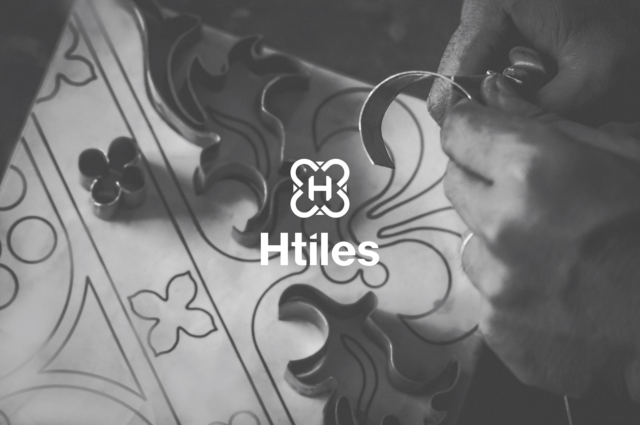
Keep the tradition values
As a famous brick tile manufacturer in the North of Viet Nam with a large-scale production facility of over 5000 m2 in Hoa Binh but it is very difficult to access the market in the 2010s because encaustic cement tiles are considered as an antique product.
- Fields
Industrial Products
- Scope of Work
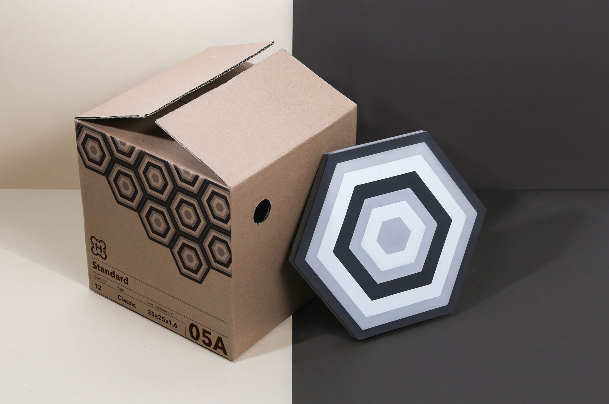
Brochure
Website
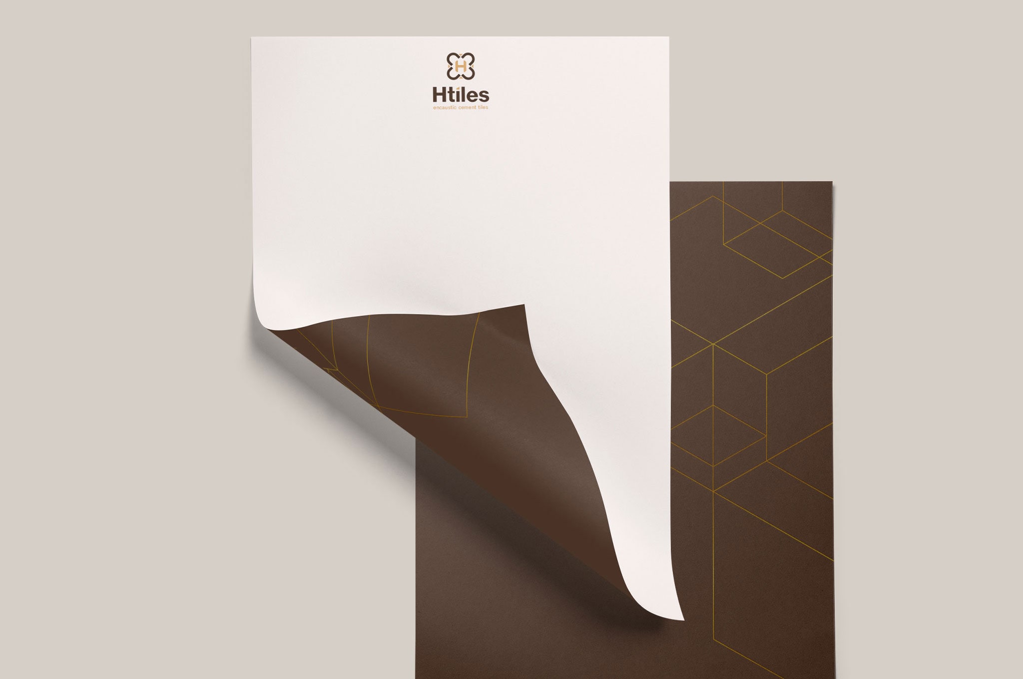
Identity
The founders of H-Tiles decide to modernize production, design new models also create a new look for the brand to access the market. In addition, H Tiles is looking for a position in the international market for the long term.
Imagine the expected H Tiles
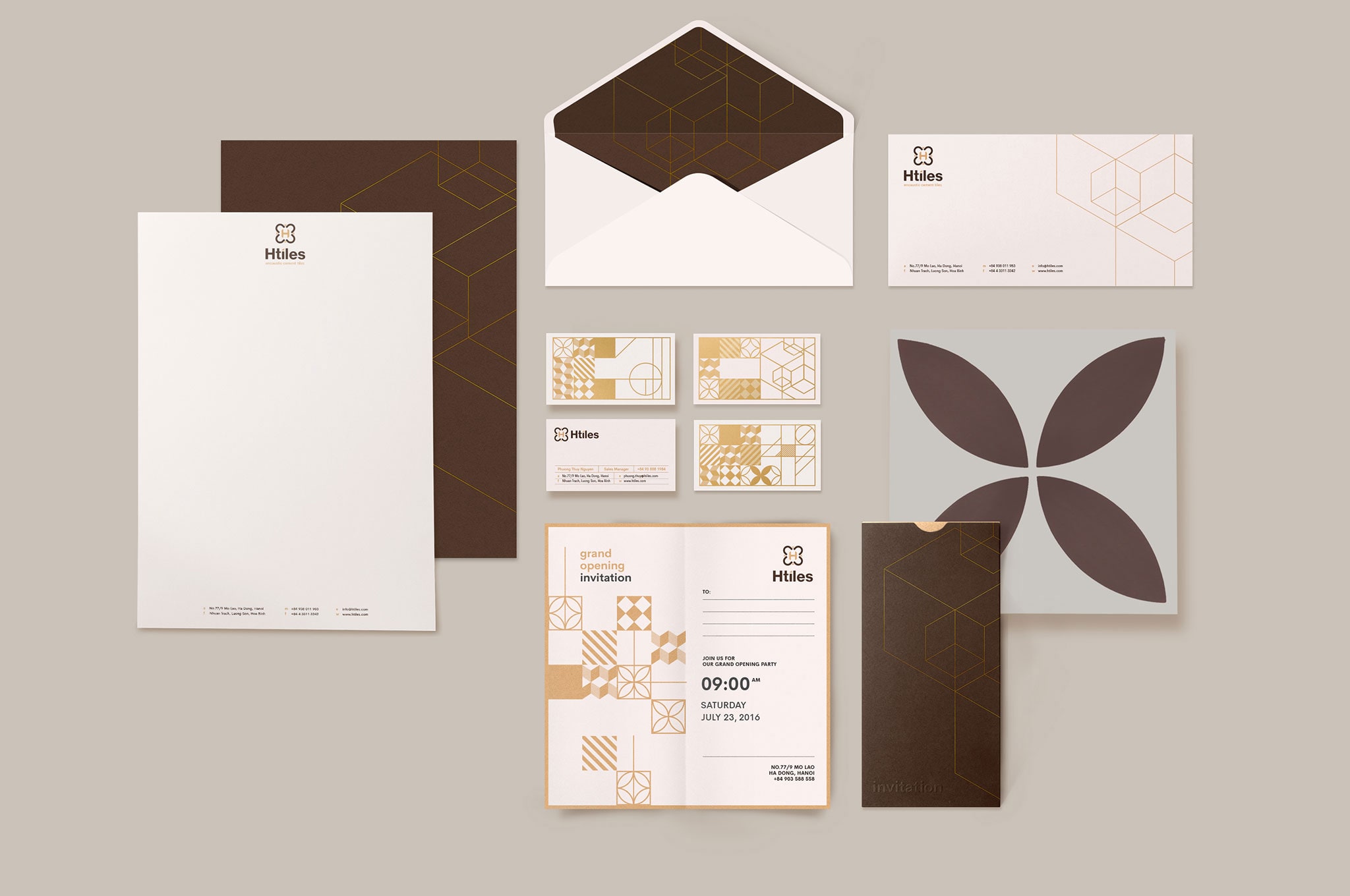
Creating a brand identity of H Tiles that bring classical culture in a modern style, aimed at customers with high aesthetic taste and modern works with retro markings. Besides being a product of Western origin (imported from the French colonial period), the brand image must have a national character in it.
A blend of the past and the presence
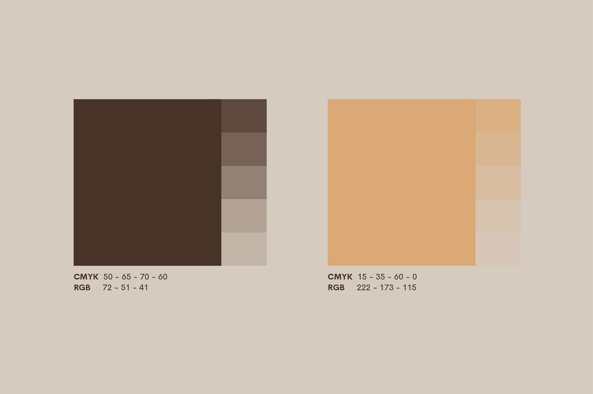
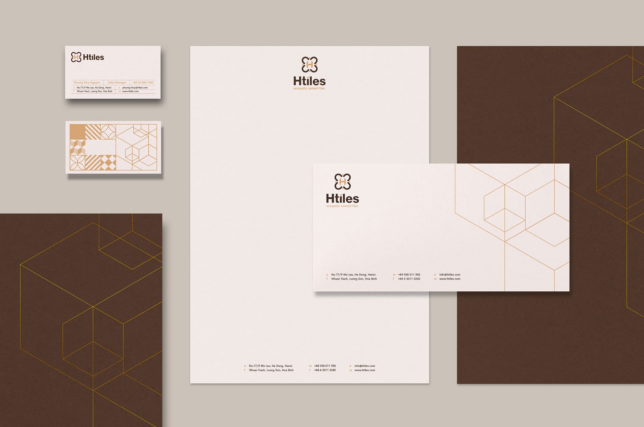
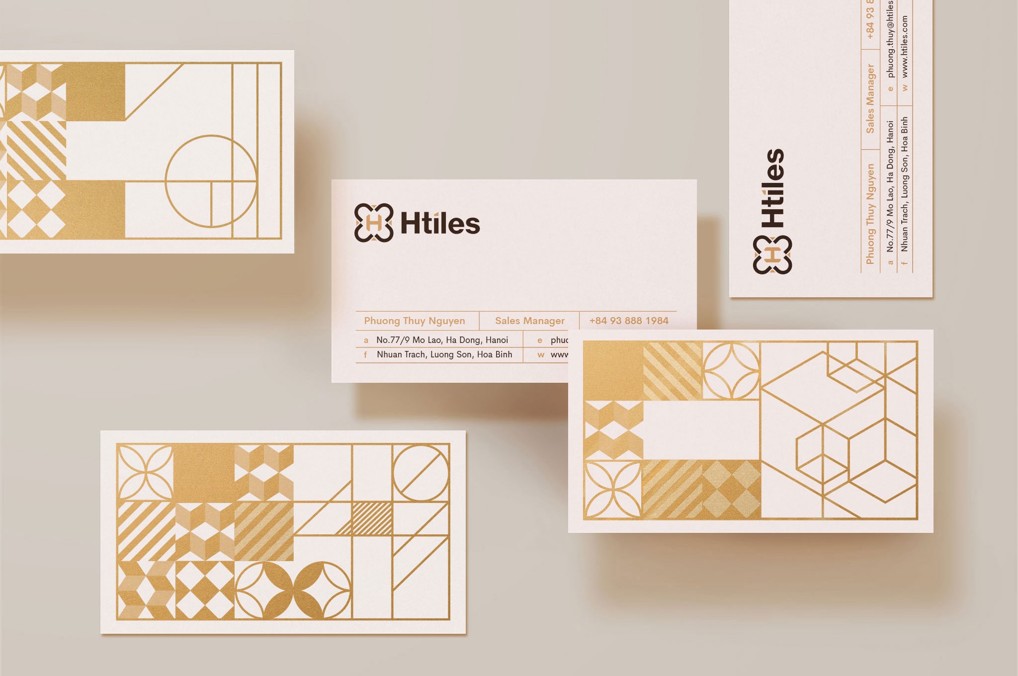
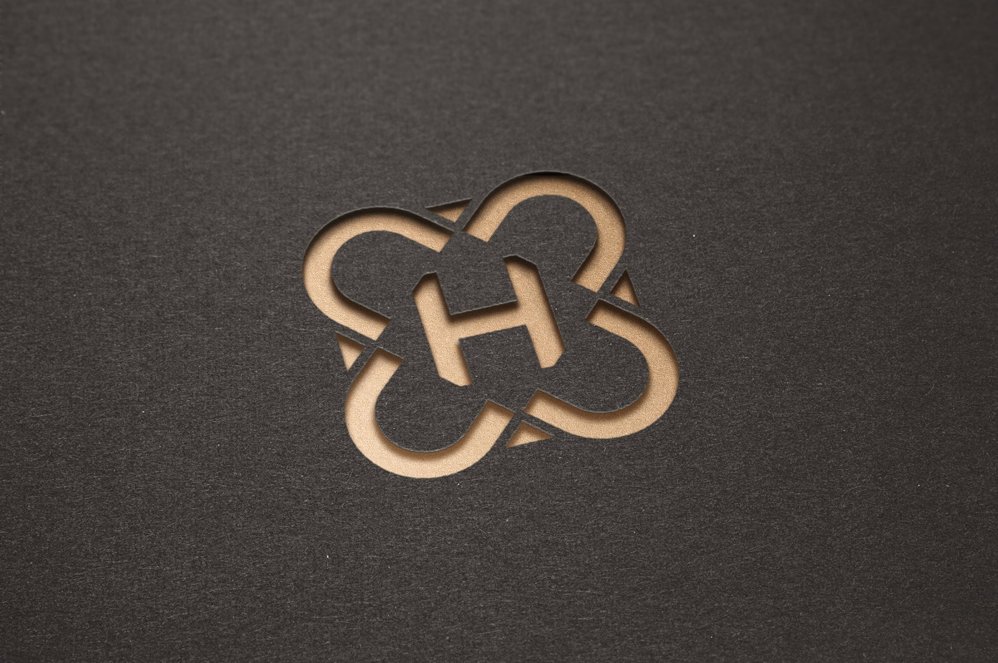
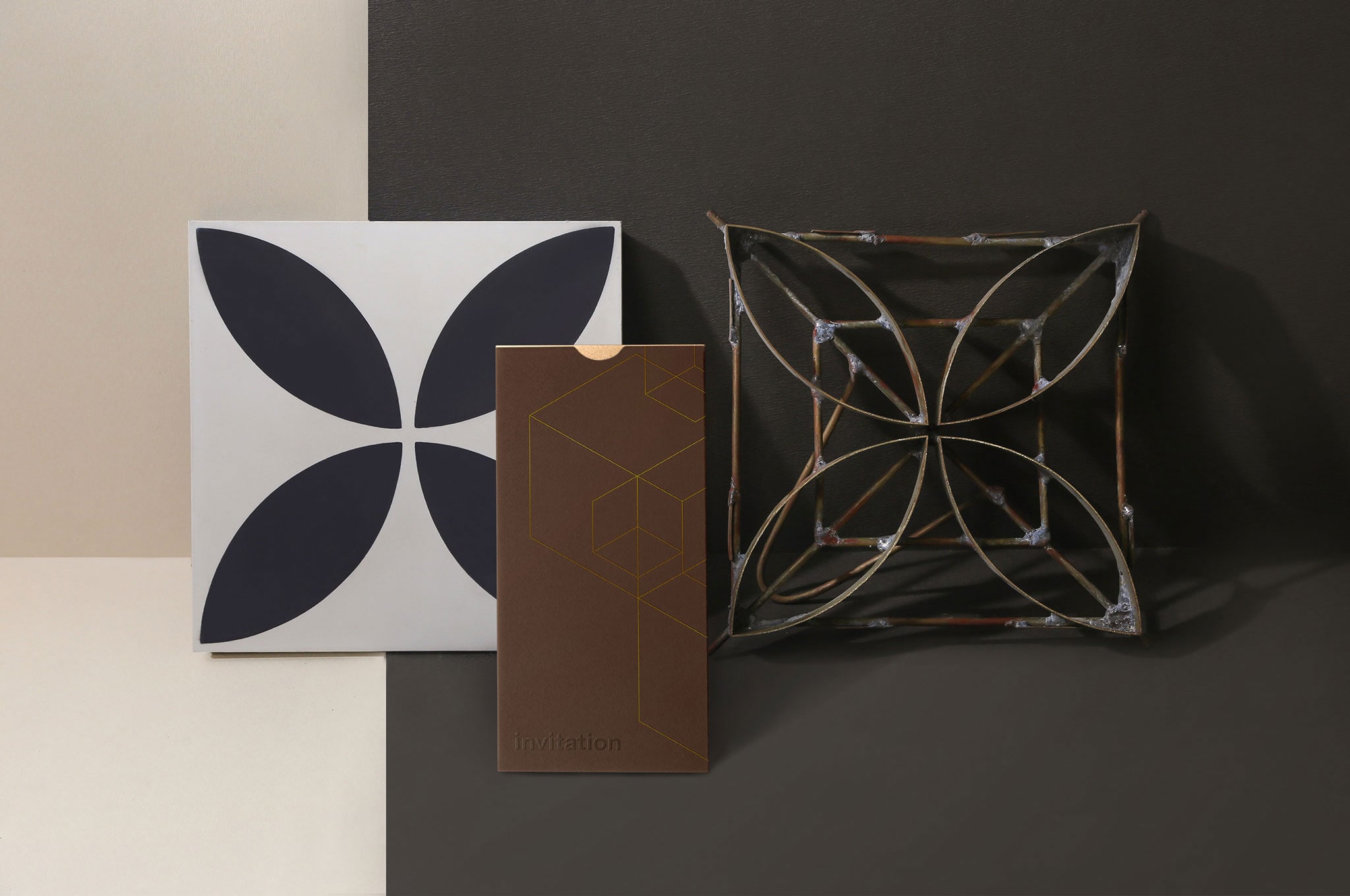
H Tiles’s logo created by B&A inspired by ceramic tiles with 4-axis symmetrical and patterns of ethnic groups in Vietnam. The icon is simple enough to show the spirits of the brand. The text is not rooted too closely, using sans serif font to express organic, slightly hand-made and intentional imperfections. The whole brings an image of art but still close.
With the persistence in the long-term sustainability strategy, H Tiles tile products have been gradually asserting its foothold in the domestic market and are ready to expand overseas network.


